边框渐变
html
<!DOCTYPE html>
<html lang="en">
<head>
<meta charset="UTF-8">
<style>
/* 输入框容器 */
.input-wrapper {
display: flex;
justify-content: center;
align-items: center;
height: 100vh;
background-color: #f4f4f4;
}
/* 跑马灯输入框 */
.marquee-input {
width: 400px;
height: 42px;
padding: 0 14px;
font-size: 16px;
border: 2px solid transparent;
border-radius: 10px;
outline: none;
color: #333;
background:
linear-gradient(white, white) padding-box,
linear-gradient(270deg,
#ff4d4d, #ffa64d, #ffff4d, #4dff88,
#4dd2ff, #b84dff, #ff4da6, #ff4d4d
) border-box;
background-size: 400% 100%;
background-repeat: repeat;
background-position: 0 0;
animation: marquee-border 6s linear infinite;
transition: box-shadow 0.3s ease;
}
/* 动画关键帧 */
@keyframes marquee-border {
0% {
background-position: 0% 0;
}
100% {
background-position: 100% 0;
}
}
/* placeholder 样式 */
.marquee-input::placeholder {
color: #999;
font-style: italic;
}
/* hover + focus 时加点炫光效果 */
.marquee-input:hover,
.marquee-input:focus {
box-shadow: 0 0 8px rgba(255, 77, 77, 0.3), 0 0 20px rgba(77, 210, 255, 0.4);
}
</style>
</head>
<body>
<div class="input-wrapper">
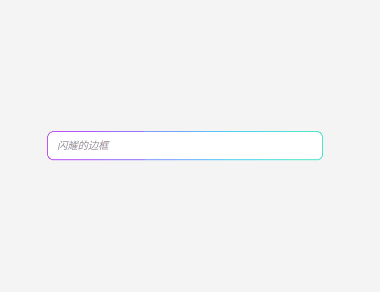
<input type="text" placeholder="闪耀的边框" class="marquee-input" />
</div>
</body>
</html>