Tailwind踩坑实录
https://github.com/dL-hx/myBlog/blob/master/docs/fe-css/css-tailwind/tailwindcss.zip
一 Tailwind CSS 基础
1.1 有了解过那些样式实现方案? 为什么 AI 产品都选择 Tailwind CSS 作为样式方案 ?
主流样式体系方案
手写原生 CSS & CSS 预处理器 (Sass / Less)
cssinjs (styled-components, emotion)
- 优势:
- 组件化: 样式与组件逻辑内聚,方便复用和维护
- 动态样式:可以方便地基于组件的 props 或 state 动态改变样式
- 问题:
- 运行时开销: 需要在运行时解析 JS 并生成 CSS ,带来一定的性能损耗
- 心智负担: 在JS 和 CSS 之间切换语法, 需要学习特定库的API
- 优势:
原子化CSS(Tailwind CSS)
- 核心思想: 你不再为组件编写专门的CSS 类,而是在HTML中组合这些原子类来构建样式
<!-- 原 CSS 实现 -->
<button class="btn-primary"> Submit</button>

<style>
  .btn-primary {
   background-color: #3b82f6;
   color: #fff;
   padding: 8px 16px;
   border-radius: 4px;
  }

</style>
<!-- Tailwind CSS 实现 -->
<button class="bg-blue-500 text-white py-2 px-4 rounded">
  Submit
</button>- 优势:
- 无需思考命名: 从根本上消除了为 class 命名的烦恼
- 无需切换文件: 样式和结构在一起,开发心流不会被打断
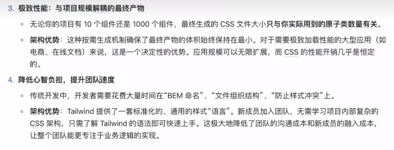
- 极致的性能: 通过 PurgeCSS 等工具,在构建时扫描样式文件,只讲用到的原子类, 打包到最终的CSS文件中,体积通常只有几 KB
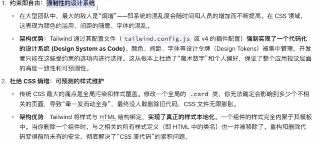
- 约束与一致性:所有的样式都来自于预设的 desigin tokens (在tailwind.config.js中定义), 保证了整个项目视觉上的一致性
1.2 为什么 AI时代 ,Tailwind CSS 更受欢迎?
- 追求极致的开发和迭代速度
- 专注功能,而非繁琐的样式细节
- 与现代前端框架的完美契合
- AI 场景下的明星产品案例
- OpenAI 的 ChatGPT: 其简洁,响应迅速的对话界面,大量使用 Tailwind CSS 来实现布局和样式
- Vercel AI Playground : 作为前端领域的技术领导者,其推出的AI 产品与模板库,官方首选Tailwind CSS
- Hugging Face: 组件与布局深度契合Tailwind CSS
1.3 说说 Tailwind CSS 工程初始化,内核,工具体系完整内容,详细说明在业务,组件库场景的应用?
$ npx pnpm create vite 1.basic --template=vanilla-ts
$ pnpm i
$ cd 1.basic初始化
node: 20.19.0
tailwindcss : 4.x
安装依赖:
    "tailwindcss":"4.1.8",
"@tailwindcss/vite":"4.1.8"直接去样式主入口中引入 tailwindcss
src\style.css
@import "tailwindcss";vite.config.js
import { defineConfig } from 'vite'
import tailwindcss from '@tailwindcss/vite'

export default defineConfig({
  plugins: [tailwindcss()],
  server:{
    port:5273,
  }
})如何编译tailwindcss, 输出为一个css文件
再将编译生成出的css文件引入 .html文件中
{
  // ... 其他配置 ...
  "scripts": {
    "start": "vitepress dev",
    "dev": "vitepress dev",
    "build": "vitepress build",
    "preview": "vitepress preview",
+   "build:tailwind": "npx tailwindcss -i ./src/styles/tailwind.css -o .src/tailwind.output.css --minify"
  },
// ... 其他配置 ...核心概念
使用原子类进行样式设置
每个类名代表一个 单一,不可再分的CSS属性
- font-bold 对应 font-weight:700;
- text-center 对应 text-align: center;
- p-4 对应 padding: 1rem
- flex 对应 display: flex
-mt-8对应 距顶-8remp-0 px-0 x 表示左右;py-0 y 表示上下
这种模式可以在HTML中完成所有样式工作,提高开发体验

<!doctype html>
<html lang="en">

<head>
  <meta charset="UTF-8" />
  <link rel="icon" type="image/svg+xml" href="/vite.svg" />
  <meta name="viewport" content="width=device-width, initial-scale=1.0" />
  <title>web</title>
</head>

<body>
  <div id="app"></div>
  <!-- <div class="bg-red-200 text-white w-[200px] h-[200px]">xxxx</div> -->
  <div class="bg-red-200 text-white size-[200px] relative  rounded-[16px] p-[8px] hover:bg-violet-600">
    xxxx
    <div class="bg-blue-200 size-[100px] absolute top-[30px] left-[20px] rounded-[16px]">
      xxxx
    </div>
  </div>
  <script type="module" src="/src/main.ts"></script>
</body>

</html>- flex flex 类用于创建一个弹性容器,使你可以轻松控制子元素的对齐和间距。可以将其与 justify-center 和 items-center 等类搭配使用,以实现精确的对齐。
<div class="flex justify-center items-center">
  Hello, Tailwind!
</div>- grid grid 类用于创建一个网格容器,提供了一种强大的方式来设计响应式布局。你可以将其与 grid-cols-2、grid-cols-3 等类搭配使用,以定义列数。
<div class="grid grid-cols-3 gap-4">
  <div>Item 1</div>
  <div>Item 2</div>
  <div>Item 3</div>
</div>- p 和 m(内边距和外边距) 内边距(p)和外边距(m)类使间距调整变得简单。例如,p-4 添加内边距,m-4 添加外边距。
<div class="p-4 m-4">
  这个盒子有内边距和外边距。
</div>- bg(背景) bg 类允许你设置背景颜色。你可以使用预定义的颜色,如 bg-red-500,或渐变,如 bg-gradient-to-r。
<div class="bg-green-500 text-white p-4">
  成功消息!
</div>- text(排版) text 类对于控制字体大小、颜色和对齐至关重要。例如,text-xl 使文本变大,text-center 使其居中。
<h1 class="text-xl text-center">
  欢迎使用 Tailwind
</h1>- rounded(圆角) rounded 类用于为元素添加圆角。你可以使用 rounded-lg 或 rounded-full 等修饰符来调整圆角半径。
<img src="avatar.jpg" class="rounded-full" alt="Avatar">- shadow(阴影) 使用 shadow 类为设计添加深度。你可以使用 shadow-md 或 shadow-lg 等变体来实现不同的阴影强度。
<div class="shadow-lg p-4">
  带阴影的盒子
</div>- h 和 w(高度和宽度) 使用 h(高度)和 w(宽度)类来控制元素的尺寸。例如,h-64 设置高度,w-full 使元素占据整个宽度。
<div class="h-64 w-full bg-blue-500">
  尺寸盒子
</div>- flex-wrap 和 gap flex-wrap 类确保弹性容器中的项目在必要时换行。gap 类在项目之间添加一致的间距。
<div class="flex flex-wrap gap-4">
  <div>Item 1</div>
  <div>Item 2</div>
  <div>Item 3</div>
</div>- hover(悬停状态) Tailwind 使得定义悬停状态变得简单。例如,hover:bg-blue-700 在用户悬停在元素上时改变背景颜色。
<button class="bg-blue-500 hover:bg-blue-700 text-white p-2">
  悬停我
</button>色值体系
https://tailwindcss.com/docs/colors
@apply用法
<div class="miaoma-btn">btn</div>

<style>
.miaoma-btn{
  @apply bg-blue-200 size-[100px] absolute top-[30px] left-[20px] rounded-[16px]
}
</style>@utility @theme用法
<div class="miaoma-btn-green">btn</div>


<div class="text-shadow-green">有绿色阴影的文字</div>
<button class="btn-miaoma">btn</button>

<style>
@theme {
  --color-primay-green: #28a745;
  --color-primay-yellow: #ffc107;
  --color-primay-red: #dc3545;
}


@utility btn-miaoma{
  background: black;
  @variant dark{/* 暗黑模式 */
    background: gray;
  }
}


@utility miaoma-btn-*{
  background-color: --value(--color-primay-*);
}


@utility text-shadow-* {
  text-shadow: 2px 2px 4px --value(--color-primay-*);
}
</style>1.4 业务与组件库场景实战应用
在业务系统中的应用(追求效率与一致性)
在开发内部后台、管理仪表盘或面向用户的Web应用时,效率和一致性是首要目标。
- 1.95%的场景直接使用工具类:对于页面布局、卡片、表单等,直接在Vue组件的模板中组合工具类。这是最 快、最直观的方式。
- 2.封装可复用组件:将高频出现的UI 模式(如Button,Card,Input,Modal)封装成Vue组件。样式(工 具类)写在组件内部,对外只暴露props。这样整个应用的视觉风格由这些基础组件决定,高度统一。
- 3.配置文件是唯一真相来源(SingleSourceofTruth):将公司的品牌色、标准间距、字体规范等全部定义 在vite.config·js的tailwindcss插件配置中。所有开发者都基于此进行开发,从根本上保证了UI的 一致性。
- 4.@apply用于特殊场景:比如,对于从富文本编辑器生成的、无法直接修改HTML结构的内容,可以定义一个
.prose样式的类来统一渲染。
1.5 在通用组件库中的应用(追求灵活性与可扩展性)
开发一个给别人使用的组件库时,思路需要转变。你的目标不是定死样式,而是提供一个无头(Headless)或易于主题化的骨架。
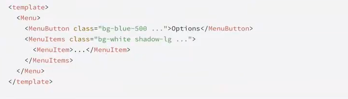
无头组件 (Headless UI)模式:
这是最灵活的方式。你的组件库只提供功能和状态管理,完全不提供任何样式。
- 实现方式:组件通过作用域插槽(scopedslots) 将内部状态和方法暴露出去,让使用者自己决定用什么 HTML标签和Tailwind类来渲染。
例子:HeadlessUI库就是这种模式的典范。它提供了一个Menu组件,但按钮和下拉项长什么样完全由你决定。
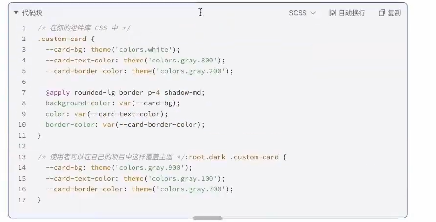
可主题化(Themable)模式:
提供一套默认样式,但允许使用者轻松地进行覆盖和定制。
- 实现方式
- 使用@apply为组件定义一套基础的、结构化的class。
- 将关键的可变样式(如颜色、边框、背景)通过**CSS自定义属性(CSSVariables)**暴露出来。
- 使用者不需要修改你的组件库源码,只需要在自己的项目中覆盖这些CSS变量,就能实现主题切换(比如 暗黑模式)。
<button class="btn-miaoma">btn</button>

<style>
@utility btn-miaoma{
  background: black;
  @variant dark{/* 暗黑模式 */
    background: gray;
  }
}

</style>这种方式在提供开箱即用体验的同时,也保留了高度的灵活性,是许多现代组件库(如shadcn/ui)采用的核心用法
vue项目中使用
$ pnpm create vite 2.vue --template vue-ts
$ cd 2.vue
$ pnpm i安装依赖:
    "tailwindcss":"4.1.8",
"@tailwindcss/vite":"4.1.8"直接去样式主入口中引入 tailwindcss
src\style.css
@import "tailwindcss";vite.config.js
import { defineConfig } from 'vite'
import vue from '@vitejs/plugin-vue'
import tailwindcss from '@tailwindcss/vite';

// https://vite.dev/config/

export default defineConfig({
  plugins: [vue(), tailwindcss()],
})react项目中使用
$ pnpm create vite 3.react --template react-ts
$ cd 3.react
$ pnpm i安装依赖:
    "tailwindcss":"4.1.8",
"@tailwindcss/vite":"4.1.8"直接去样式主入口中引入 tailwindcss
src\style.css
@import "tailwindcss";vite.config.js
import { defineConfig } from 'vite'
import react from '@vitejs/plugin-react'
import tailwindcss from '@tailwindcss/vite';

// https://vite.dev/config/
export default defineConfig({
  plugins: [react(), tailwindcss()],
})1.6 站在前端架构的角度,详细说说 Tailwind CSS 框架优势及原理, 如何从0到1 构建Tailwind 及组件库生态?
二 Tailwind CSS 进阶
2.1 举例说明 css ,cssinjs ,tailwindcss的使用技巧与方案价值体现
module css
- 变量复用
- CSS3 变量 --primary: pink, tokens
:root{
  --color-primary: pink;
  --bg-primary: white;

  --margin:2px;
  --padding:2px;
}- BEM命名规范,
  - 举例:
  - .card {}
  - .card__header {}
  - .card__body {}
  - .card--primary {}
- .card__body--primary {}- Flex, Grid布局
cssinjs
- 动态样式
- 样式隔离
- less sass嵌套规则
Header.tsx
import styles from './Header.module.less';

function Header() {
  return (
    <header className={styles.header}>
      <div className={styles.logo}>MyApp</div>
      <nav className={styles.nav}>
        <a href="/" className={styles.link}>首页</a>
        <a href="/about" className={styles.link}>关于</a>
        <a href="/contact" className={styles.link}>联系</a>
      </nav>
    </header>
  )
}

export default Header;Header.module.less
.header {
  background-color: white;
  box-shadow: 0 2px 4px rgba(0,0,0,0.1);
  padding: 1rem 1.5rem;
  display: flex;
  align-items: center;
  justify-content: space-between;
}

.logo {
  font-size: 1.25rem;
  font-weight: bold;
  color: #2563eb;
}

.nav {
  display: flex;
  gap: 1.5rem;
}

.link {
  color: #4b5563;
  text-decoration: none;
  transition: color 0.2s;
}

.link:hover {
  color: #3b82f6;
}styled-components定义组件
index.css
:root {
  /* 主色调 */
  --color-primary: #1890ff;
  --color-primary-hover: #40a9ff;
  --color-primary-active: #096dd9;

  /* 中性色 */
  --color-text: rgba(0, 0, 0, 0.88);
  --color-text-secondary: rgba(0, 0, 0, 0.65);
  --color-border: #d9d9d9;
  --color-bg: #ffffff;
  --color-bg-secondary: #f5f5f5;

  /* 功能色 */
  --color-success: #52c41a;
  --color-warning: #faad14;
  --color-error: #ff4d4f;
  --color-info: #1890ff;

  /* 状态色 */
  --color-disabled: rgba(0, 0, 0, 0.25);
  --color-disabled-bg: #f5f5f5;
}然后在你的主样式文件中引入这个变量文件:
index.css
@import './variables.css';

/* 其他全局样式 */
body {
  color: var(--color-text);
  background-color: var(--color-bg);
}使用这些变量的示例
.button {
  background-color: var(--color-primary);
  color: white;
  border: 1px solid var(--color-border);
}

.button:hover {
  background-color: var(--color-primary-hover);
}三 AI时代 Tailwind CSS 最佳实践
四 Tailwind CSS 组件封装实战
1. 组件代码 (Button.tsx)
- 安装依赖
- 确保已安装 styled-components 和 @types/styled-components:
$ pnpm add styled-components @types/styled-components -Dimport styled from 'styled-components';
// 定义按钮类型
type ButtonType = 'primary' | 'secondary' | 'ghost' | 'danger';
type ButtonSize = 'small' | 'medium' | 'large';
type ButtonProps = {
type?: ButtonType;
size?: ButtonSize;
children: React.ReactNode;
onClick?: () => void;
disabled?: boolean;
className?: string;
};
const Button = ({
type = 'primary',
size = 'medium',
children,
onClick,
disabled = false,
className
}: ButtonProps) => {
return (
<StyledButton
$type={type}
$size={size}
onClick={onClick}
disabled={disabled}
className={className}
>
{children}
</StyledButton>
);
};
// 样式定义
const StyledButton = styled.button<{
$type: ButtonType;
$size: ButtonSize
}>`
display: inline-flex;
align-items: center;
justify-content: center;
border-radius: 4px;
cursor: pointer;
transition: all 0.2s;
border: 1px solid;
font-weight: 500;
white-space: nowrap;
/* 尺寸样式 */
${({ $size }) => {
switch ($size) {
case 'small':
return `
padding: 4px 8px;
font-size: 12px;
`;
case 'medium':
return `
padding: 8px 16px;
font-size: 14px;
`;
case 'large':
return `
padding: 12px 24px;
font-size: 16px;
`;
default:
return '';
}
}}
/* 类型样式 */
${({ $type }) => {
switch ($type) {
case 'primary':
return `
background-color: #1890ff;
color: white;
border-color: #1890ff;
&:hover {
background-color: #40a9ff;
border-color: #40a9ff;
}
&:active {
background-color: #096dd9;
border-color: #096dd9;
}
`;
case 'secondary':
return `
background-color: #f5f5f5;
color: rgba(0, 0, 0, 0.88);
border-color: #d9d9d9;
&:hover {
color: #1890ff;
border-color: #1890ff;
}
&:active {
color: #096dd9;
border-color: #096dd9;
}
`;
case 'ghost':
return `
background-color: transparent;
color: rgba(0, 0, 0, 0.88);
border-color: transparent;
&:hover {
background-color: rgba(0, 0, 0, 0.06);
color: #1890ff;
}
&:active {
background-color: rgba(0, 0, 0, 0.1);
color: #096dd9;
}
`;
case 'danger':
return `
background-color: #ff4d4f;
color: white;
border-color: #ff4d4f;
&:hover {
background-color: #ff7875;
border-color: #ff7875;
}
&:active {
background-color: #d9363e;
border-color: #d9363e;
}
`;
default:
return '';
}
}}
/* 禁用状态 */
&:disabled {
opacity: 0.6;
cursor: not-allowed;
}
`;
export default Button;2. 使用示例 (App.tsx)
import Button from './components/Button';

function App() {
  return (
    <div style={{
      display: 'flex',
      gap: '12px',
      padding: '20px',
      flexDirection: 'column',
      maxWidth: '300px'
    }}>
      <Button type="primary">主要按钮</Button>
      <Button type="secondary">次要按钮</Button>
      <Button type="ghost">幽灵按钮</Button>
      <Button type="danger">危险按钮</Button>

      <Button type="primary" size="small">小按钮</Button>
      <Button type="primary" size="medium">中按钮</Button>
      <Button type="primary" size="large">大按钮</Button>

      <Button
        type="primary"
        onClick={() => alert('按钮被点击')}
      >
        点击我
      </Button>

      <Button type="primary" disabled>
        禁用按钮
      </Button>
    </div>
  );
}

export default App;tailwindcss
- 原子化类名
- 样式集中管理 ,
tailwind.config.js
总结
- 客户端渲染方式(vue, react): cssinjs
- 服务端渲染: modulecss, tailwindcss